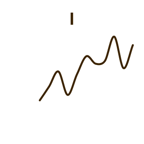
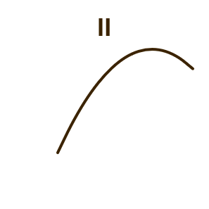
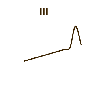
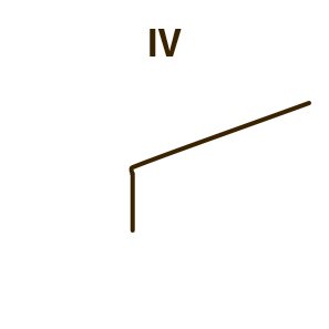
| I | II | III | IV | ||||
| x | y | x | y | x | y | x | y |
| 4 | 4,26 | 4 | 3,1 | 4 | 5,39 | 8 | 5,25 |
| 5 | 5,68 | 5 | 4,74 | 5 | 5,73 | 8 | 5,56 |
| 6 | 7,24 | 6 | 6,13 | 6 | 6,08 | 8 | 5,76 |
| 7 | 4,82 | 7 | 7,26 | 7 | 6,42 | 8 | 6,58 |
| 8 | 6,95 | 8 | 8,14 | 8 | 6,77 | 8 | 6,89 |
| 9 | 8,81 | 9 | 8,77 | 9 | 7,11 | 8 | 7,04 |
| 10 | 8,04 | 10 | 9,14 | 10 | 7,46 | 8 | 7,71 |
| 11 | 8,33 | 11 | 9,26 | 11 | 7,81 | 8 | 7,91 |
| 12 | 10,84 | 12 | 9,13 | 12 | 8,15 | 8 | 8,47 |
| 13 | 7,58 | 13 | 8,74 | 13 | 12,74 | 8 | 8,84 |
| 14 | 9,96 | 14 | 8,1 | 14 | 8,84 | 19 | 12,5 |
Visualizing data is crucial because summary statistics—no matter how precise – can never tell the full story. Measures like the mean, standard deviation, and correlation coefficient reduce complex datasets into just a few numbers, and in doing so, they inevitably lose information about the underlying structure. Anscombe’s Quartet perfectly demonstrates this danger: all four datasets share nearly identical means, variances, and correlations, yet when plotted, they reveal completely different patterns.Without visualization, a researcher relying only on the numbers would incorrectly conclude that all four datasets behave the same way.
Beyond detecting non-linear patterns and outliers, visualization helps with data quality checks – spotting entry errors, missing values, or impossible numbers becomes immediate when looking at a scatterplot or box plot. Visualization also reveals distributional features like multimodality (multiple peaks) or skewness that summary statistics can obscure.Finally, graphs communicate insights more effectively to diverse audiences, enabling faster decision-making and reducing the risk of drawing false conclusions from aggregated numbers alone. Statistics give you answers, but visualizations give you questions—and often prevent you from trusting the wrong answer.
 |  |  |  |